Robin Kinross observes the 1970s scene from a friendly distance, with an expert eye on design and typography
I have always lived in the south of England, though grew up in what I felt was a Scottish micro-environment. My parents were both Edinburgh born and bred, both came to London in their twenties for work; they met and married in London. While I have ended up as a typographer, editor and publisher with the imprint Hyphen Press, my route to this destination was unplanned and it needed detours, driven by wide and I suppose ‘generalist’ interests.
In the late 1960s, leaving secondary school with science A levels, with thoughts of becoming a librarian, and interested in literature, cinema, art, politics – the magazines brought Scottish culture and discussion to me. They performed the classical function of helping me to know – or imagine – the community that I might have been living in, but wasn’t living in. How did I discover these magazines? Maybe in bookshops in Edinburgh, or perhaps in the London shops that might have carried them (Better Books? Dillons?). Around 1970, when I was a student of English literature in London, I believe I had a subscription to Scottish International, though have lost all my copies. I remember its well-funded production: A4 format and printed letterpress, with pictures on coated paper and line illustrations on the text paper. (This distant memory is open to correction.) It was in Scottish International that I first read Edwin Morgan. I became one of his constant readers.

Did Scottish International really carry an article on ‘Ibsen and Scotland’? I remember someone joking that this was like the formula of ‘X and the Polish question’, in which X could be anything – a person, a concept, an activity, any material fact. Thus one could generate a discussion almost automatically. If this joke was about Poland and Scotland, then it sounds like the voice of Neal Ascherson, whose house in Bethnal Green, borrowed from the sociologist Michael Young, I used to visit then: the Ascherson family childminder was the girlfriend of my best friend at the Polytechnic where I was a student.
At that time I certainly had a subscription to New Edinburgh Review. I have lost all those copies too. But recently I became interested in it again, looked through the run of the magazine in the British Library, and bought a few copies from second-hand shops. I wanted to rediscover the reviews of Black music – R&B, soul, ska – that were published under the byline of Dr Juke’s Rhythm Review. These were extensive and very knowledgeable discussions of hard-to-obtain records, showing an F.R.Leavis-like attention to detail and severity of judgment, sorting out the good stuff from the bland or meretricious. In his Blue Moment blog, Richard Williams had written about his ‘favourite piece of music writing’ – an article on Prince Buster by Mark Steedman. As Williams wrote, Steedman is now a professor in Edinburgh University’s School of Informatics. I got in touch with Mark Steedman, who confirmed that he was indeed Dr Juke. These reviews of very unScottish culture were for me one of the important elements of the NER.
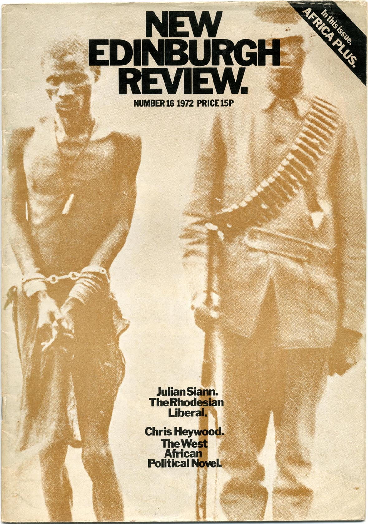
At this time I was switching from reading literature to doing typography, which in 1971 I went to the University of Reading to learn. My perceptions of the magazines were filtered through a growing typographic consciousness. New Edinburgh Review had a good phase when its design began to be professional (rather than done by enthusiastic student amateurs). I have a copy of no. 16 (1972) that shows this. The cover is printed in two colours, as previously, but now uses a photograph printed not in black but a light brown, with black titling overprinted. ‘Art and layout’ is credited to Jim Downie, with Jack Wyper and Tom Bee. Among the illustrators in this issue was Stewart McKinnon, who would then have been a postgraduate student at the Royal College of Art in London, having gone there from Edinburgh College of Art. (Rick Poyner has retrieved McKinnon’s work in an article on the Design Observer website.)
The pages inside remind me of the early design of London’s Time Out magazine, founded in 1968, and in 1970 changing its format from A5 to A4, under the direction of Pearce Marchbank. For designers, other important magazines of that time were the BBC’s Radio Times (art directed by David Driver) and, from the USA, Rolling Stone and New York, the original city listings publication.  All these magazines are cited as influences by Simon Esterson, the London designer who in the 1980s would come up to Edinburgh for brief spells to work first on Edinburgh University Student Publications Board’s Festival Times, which in 1985 gave birth to The List.
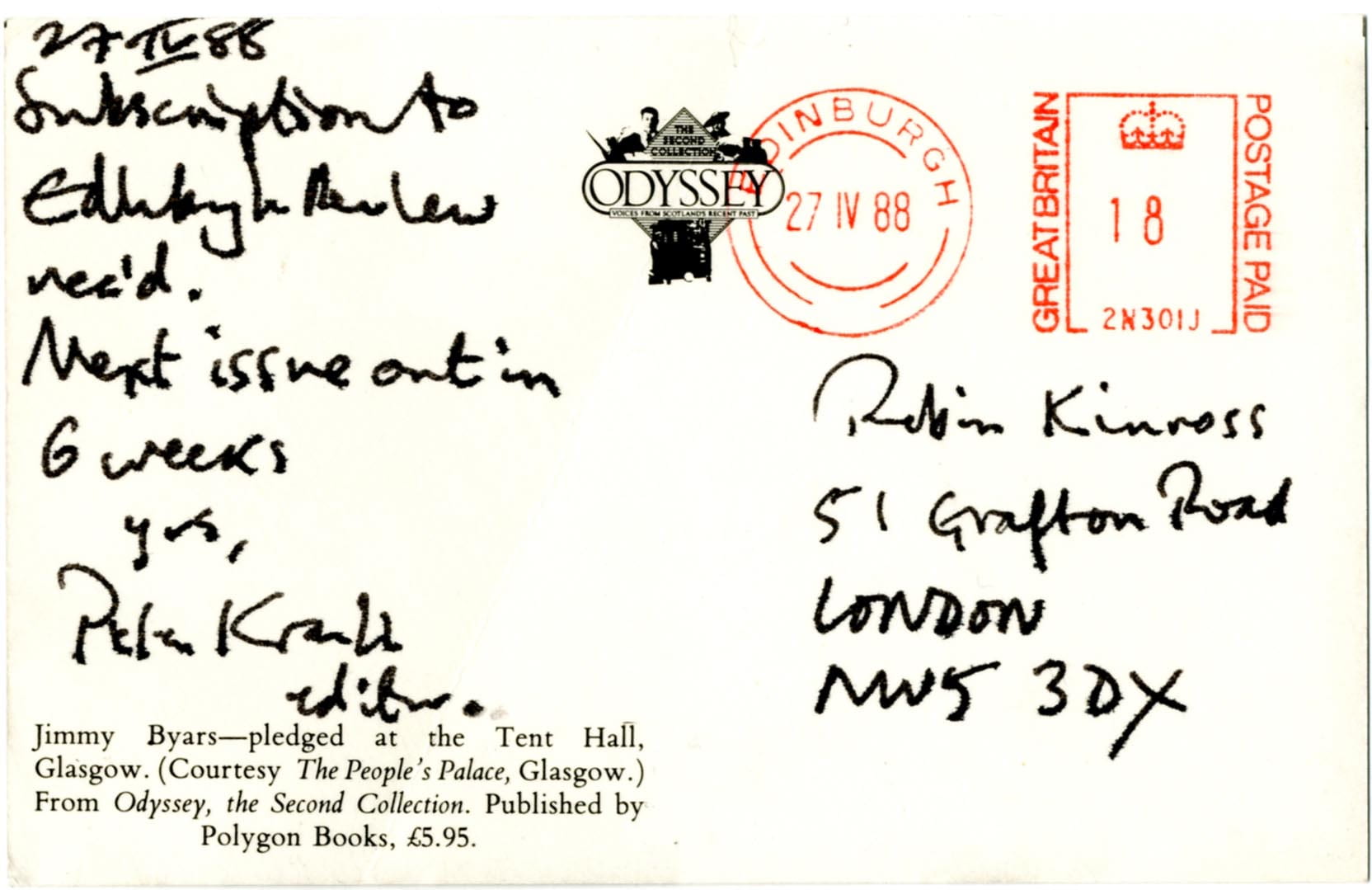
I am not sure when I discovered the re-established Edinburgh Review, launched in 1984. I think it would have been stocked by Compendium in Camden Town, near to where I lived at the time. Certainly I took out a subscription in 1988, and have a postcard from Peter Kravitz to prove this – plus all the copies still on my shelves, from no. 67/68 onwards: I must have bought back numbers to complete the series. It may have been in October 1988 that I first met Peter. It was at the Frankfurt Book Fair, where he was in charge of the Polygon stand. I introduced myself and we had the first of many absorbing conversations.
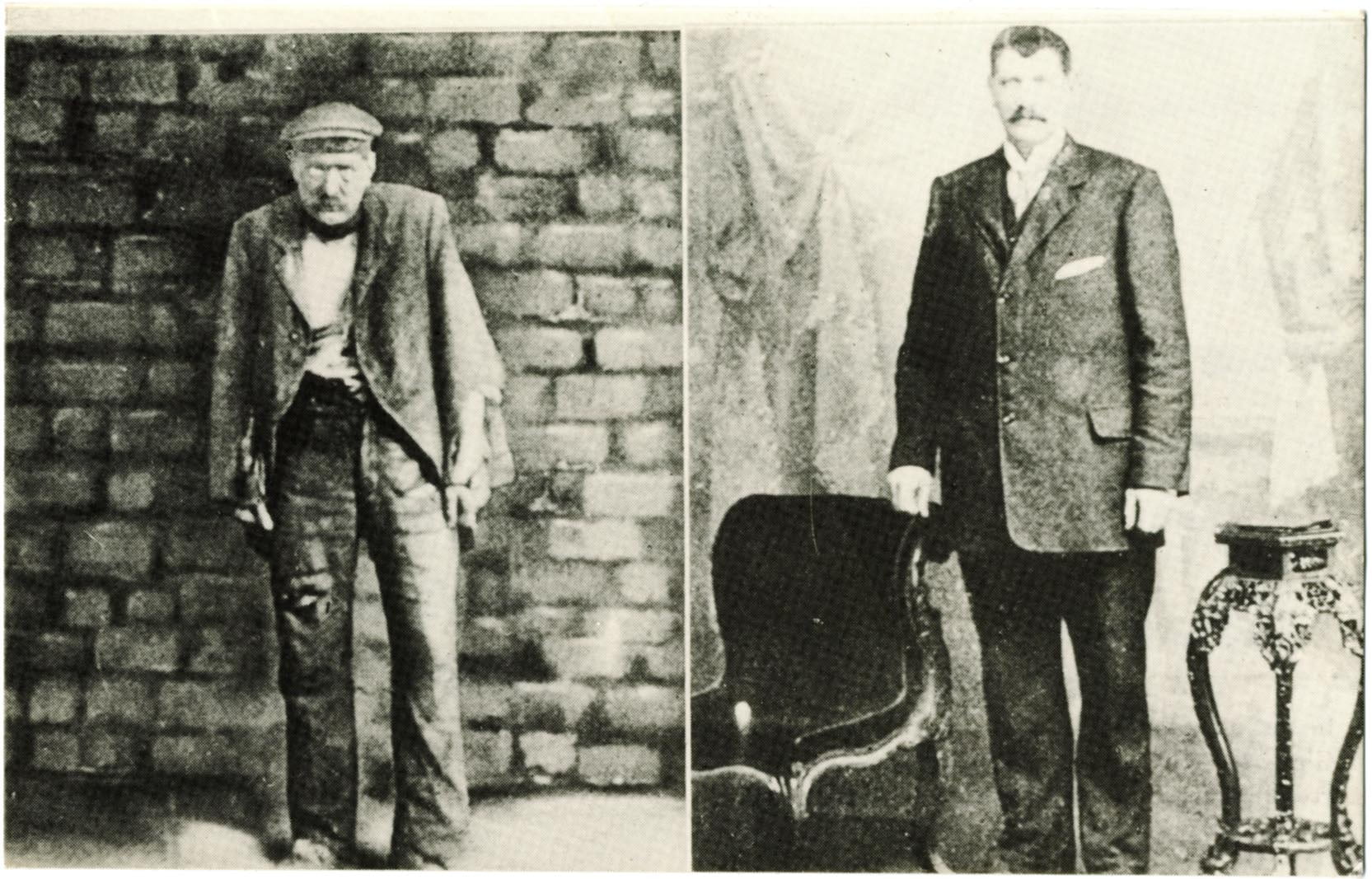
The Edinburgh Review was important for me especially for its recovery of figures such as Stuart Hood, R.D. Laing, Alexander Trocchi. I hadn’t thought of them as Scottish, but now came to understand that they were deeply so. This was an enlargement and enrichment of what Scotland meant, for me and I imagine for many others. These figures had left the country to work elsewhere and were strongly internationalist, but retained the values of their Scottish educations: a serious commitment to thought and art, with a wide range of interests. Further they had a clarity, sharpness, sometimes a violence of thought and expression, that one doesn’t find much in the mild climate of English culture. They exhibit an easy passage from the physical to the metaphysical, which is perhaps one of the traits of the Scottish-educational habit of mind.
The Scottish philosophy material in Edinburgh Review was a great discovery. I remember especially the essays in no. 74 and Richard Gunn’s essay in no. 87. The ideas of ‘common sense’ philosophy helped me in polemics over legibility to put forward an alternative to the deconstruction theory that had been picked up in design circles and which was just then (early 1990s) dominant in US and British avant-garde theorizing.
I had also subscribed to New Left Review from 1970 onwards and so read Tom Nairn’s essays on Britain and Ireland, as they came out. When some of this material was collected in The Break-up of Britain, I remember thinking ‘I have read all this already’ and so didn’t buy the book. But also the idea implied in the book’s title of Scottish or Welsh (or English!) independence seemed to be taking it a bit far. Only much later, in the run-up to the 2014 referendum, did it seem obvious and necessary.

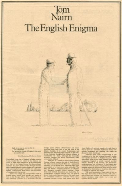
Tom Nairn was a regular contributor to the earlier issues of another London publication that I bought and read in the later 1970s. This was Bananas (1975–1981), the newspaper-format literary magazine edited by Emma Tennant, of Scottish aristocratic family, but brought up in England and living in bohemian West London. Nairn published in Bananas some of the writing that he was working on for The Break-up of Britain. Aside from that material, he contributed a scathing article on ‘The English Literary Intelligentsia’ (Bananas no. 3) – exhibiting a characteristic sharpness of expression in resuming his exposition of how England got to be the way it is, and in this case how it got to be the place that produced Kingsley Amis and Margaret Drabble. One should certainly add him to the list of wanderers who never lost the bearings of their education in Scotland.
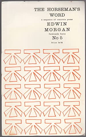
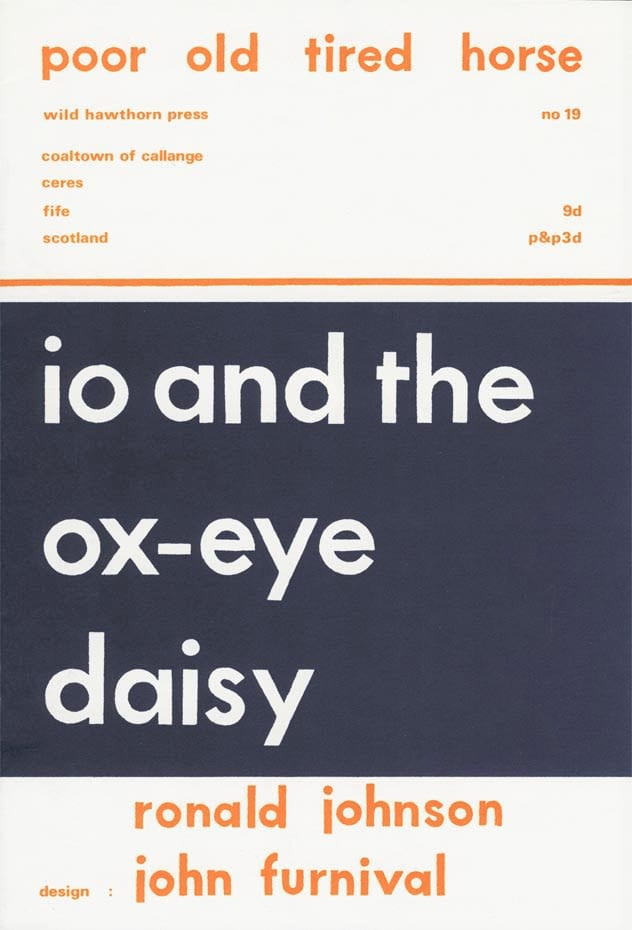
As a typographer I should perhaps have been more engaged with concrete poetry than I ever was. This wasn’t the aspect of Edwin Morgan’s writing that I valued most. I have a few issues of Ian Hamilton Finlay’s Poor.Old.Tired.Horse (1962–1967). I bought these new, some years after publication; perhaps they were still for sale in Compendium or one of the other London shops.
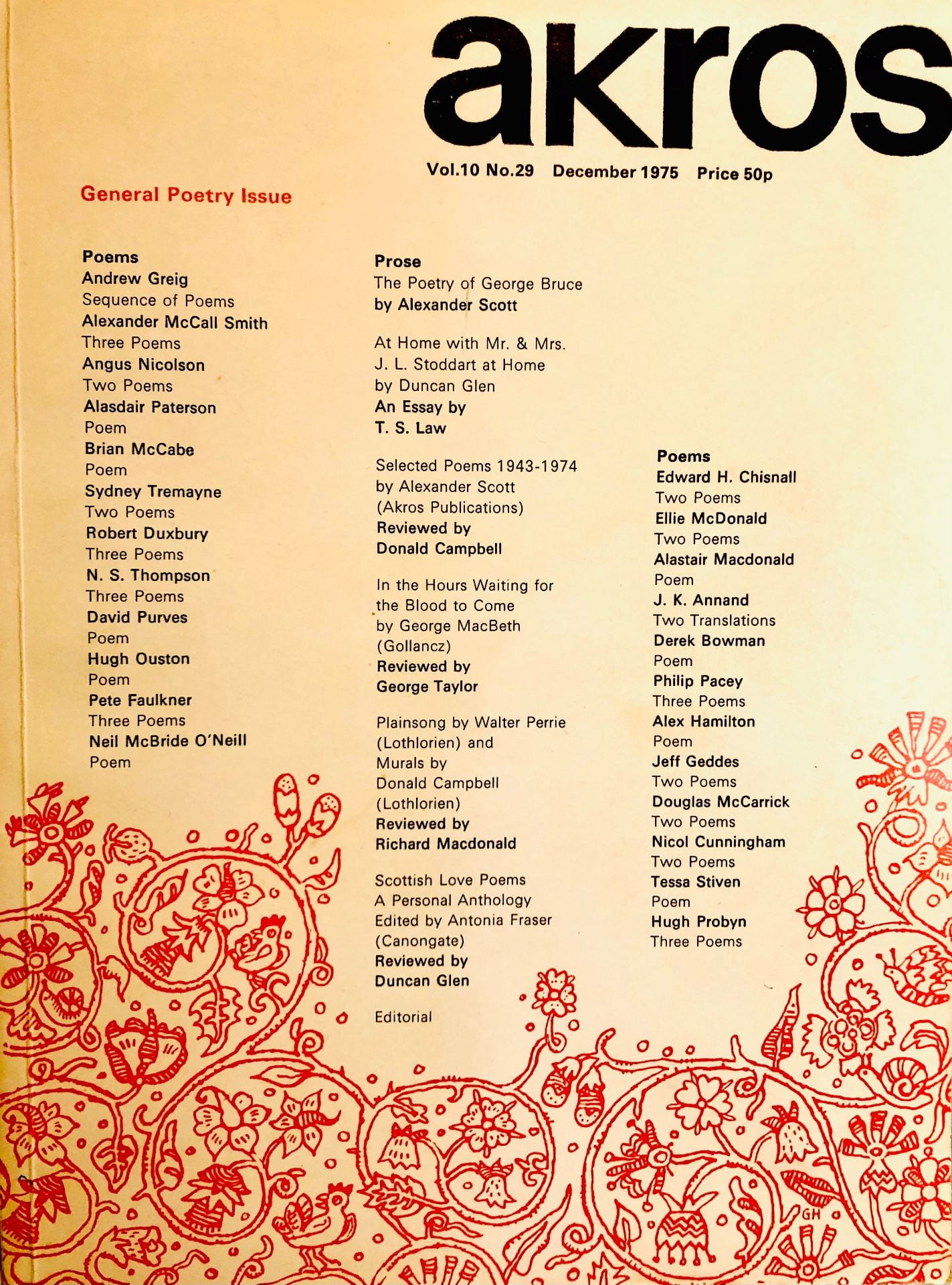
I saw a few issues of Akros, and I remember buying direct from Duncan Glen at least one publication – I think it was an interview with MacDiarmid, set on an electric typewriter. Glen was a good typographer and the magazine and its associated publications were well done in that respect. Late in his life he published a book, Printing Type Designs: A New History (2001). I have never seen this book, but from accounts of it I gather that the ‘new’ part of the history is the Scottish part. A specialist typographic bookseller in Amsterdam once asked me how to get hold of copies. I think eventually he succeeded and was able to stock it in his shop.
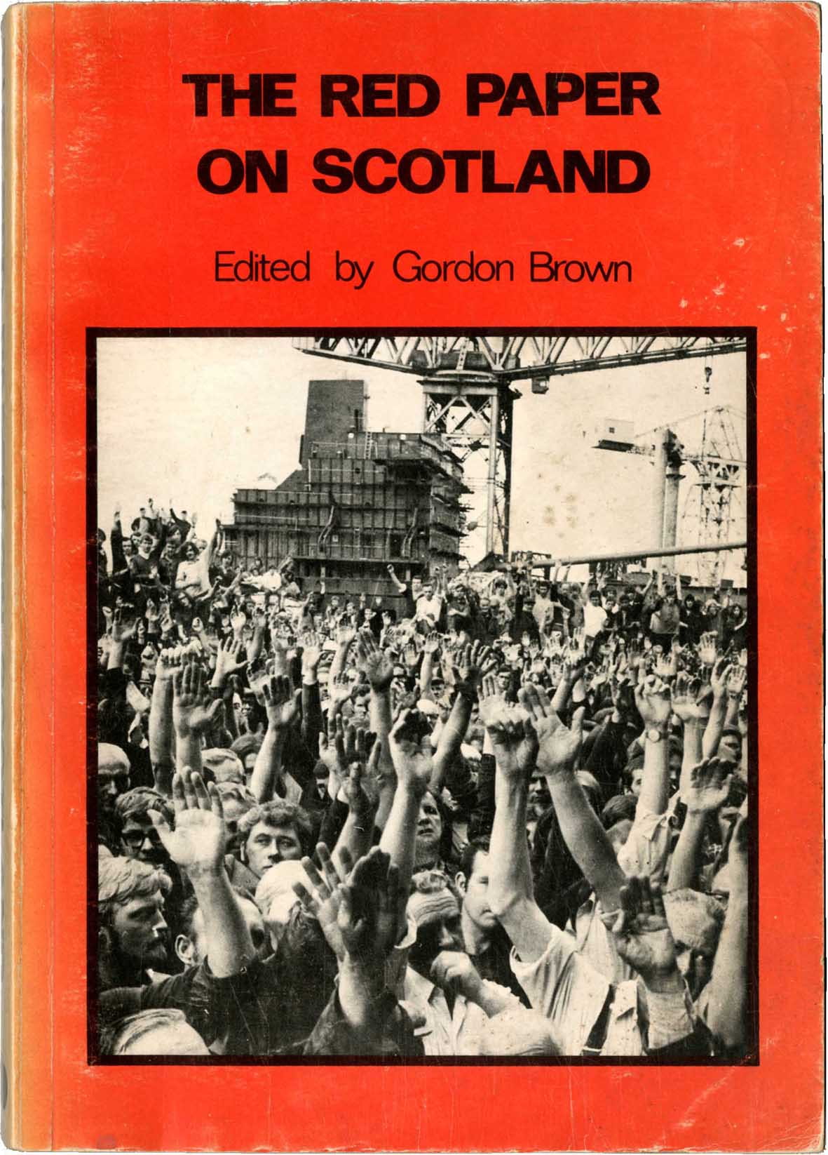 Looking at magazines through a typographic consciousness has a limiting effect. For example, I did occasionally see copies of Cencrastus and Radical Scotland, but found it tough going to actually read much in them, partly because of the amateurish design. That applies even more so to the Red Paper on Scotland, with its very small size of type, set in long lines (about 15 words per line). Neal Ascherson has called it the ‘unread paper’.

There is a technical explanation for what happened in design and production in these years. Through the post-war period and into the 1960s the predominant method of setting and printing text was with metal type and letterpress printing. Production was firmly in the hands of highly trained – and unionised – compositors and printers. But by about 1970 metal and letterpress were being deposed by photocomposition and offset lithographic printing, for reasons of cost of equipment and materials, and ease of operation. Small offset printers did not need much training to operate, and text composition with the IBM Selectric (‘golfball’) typewriters and Letraset (rub-down letters) for headlines needed no obvious skills. For a few years in the mid-1970s, the printing unions resisted this, but quite quickly gave way. In the 1970s and 1980s the pages of the small magazines were mostly pasted up – the raw materials were paper output from typewriters or the small photocomposers that came to the fore then – to make ‘camera-ready copy’ that was photographed to make film, from which printing plates were made. This was how EUSPB operated through the 1970s and most of the 1980s. It employed two compositors with union cards, though paste-up was done by non-professionals. The visible results of all this? Lines of text (especially corrections or additions) stuck down at a slight angle from the rest of the page, letters bumping into each other in headlines, rules drawn with a blotchy pen or an unsteady hand, illustrations made by someone with an idea but nothing much more than that. Towards the end of the 1980s, personal computers and especially Apple Macintoshes with page make-up software became available. At least now the lines of text were always perfectly straight.
At this time my main political commitment was to Charter 88. Every Saturday afternoon I joined a group on the steps of St Martin-in-the-Fields holding banners demanding a Bill of Rights, proportional voting, reform of the House of Lords, and so on. I always tried to get the one that demanded a Scottish Assembly. In July 1990, at the Charter’s first Constitutional Assembly, Tom Nairn sent a paper that spoke about the Charter movement: ‘the product of a southern (rather than “English” in the misleading territorial sense) political culture. Its radicalism is still permeated by a heartland ethos of confidence and possibility, still animated by high-profile assumptions of political competence. The Scottish movement, in contrast, is emerging from a low-profile, apolitical culture of submissiveness and evasion, and trying to build up an elementary self-confidence where almost nothing existed before.’
Though I certainly knew all about the ‘ethos of confidence’ of the southerners, what I valued in the Scottish movement, as seen in the magazines and more occasionally in real-life encounters with the natives, was the bringing together of culture and politics. One was not hived off from the other: the Scottish literary and visual cultures were playing a political role in affirming the nation. It wasn’t like that in England. Sometimes the Scottish voices were rough and plain, but I had the sense that something could be done through them.
Thanks to Simon Esterson for his memories of the 1980s.
Robin Kinross is the founder of Hyphen Press, and the author of Modern typography: an essay in critical history (2nd edn, 2008).