
This article is based on this programming notebook which provides more interactive detail.
👋 Introduction
Stirling council has published Open Data about its bin collections. Its data for 2021 includes town/area names. Our aim is to approximately map this data onto DataZones to extract insights.
DataZones are well defined geographic areas that are associated with (statistical) data, such as population data. This makes them useful when comparing between geographically anchored, per-person quantities – like Stirling’s bin collection quantities.
We have used the term approximately because mapping the bin collections data to DataZonesis not simple and unamibiguous. For example, the data may say that a certain weight of binned material was collected in “Aberfoyle, Drymen, Balmaha, Croftamie, Balfron & Fintry narrow access areas“, and this needs to be aportioned across several DataZones. In cases like this, we will aportion the weight across the DataZones, based on relative populations of those DataZones. Will the resulting approximation be accurate enough to be useful?
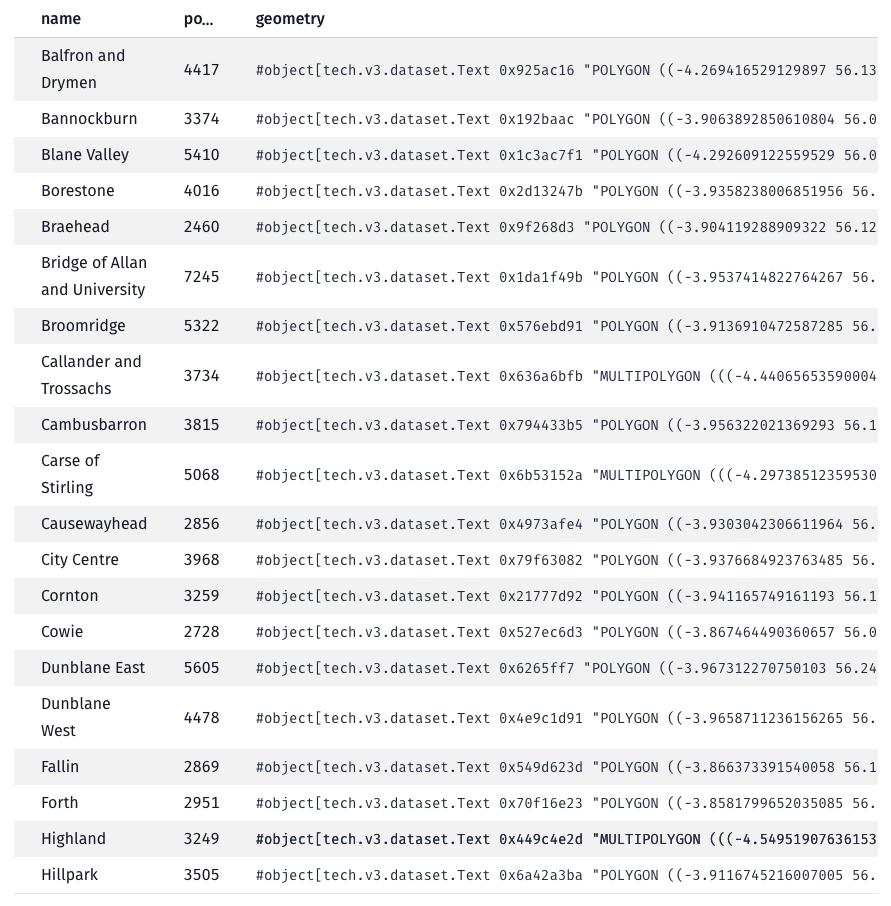
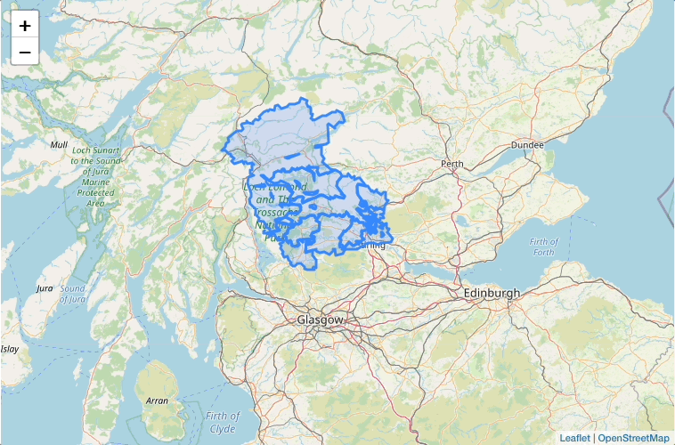
📍 DataZones
Read the DataZones data from the Scottish government’s SPARQL endpoint
Each DataZone will have a name, a geographic boundary and a population.
Plot the DataZones on a map
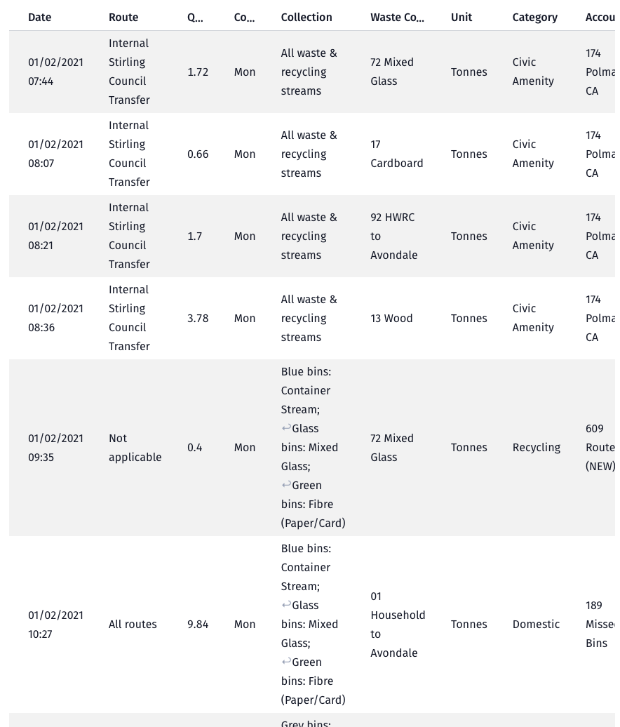
🚮 Bin collections
Read the bin collections data from Stirling council’s Open Data website
🗂️ Map bin collection routes to DataZones
Apply a pipeline of data transformers/mappings to calculate the quantities per DataZone
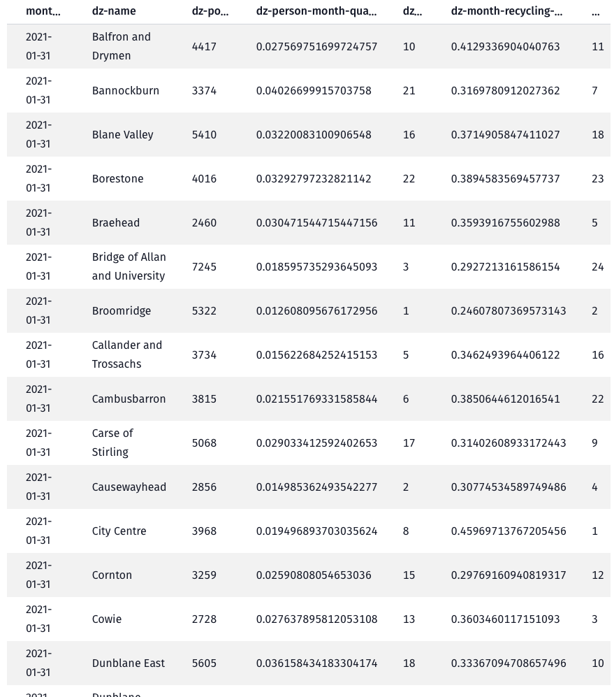
📉 Plot the bin collection quantities per DataZone
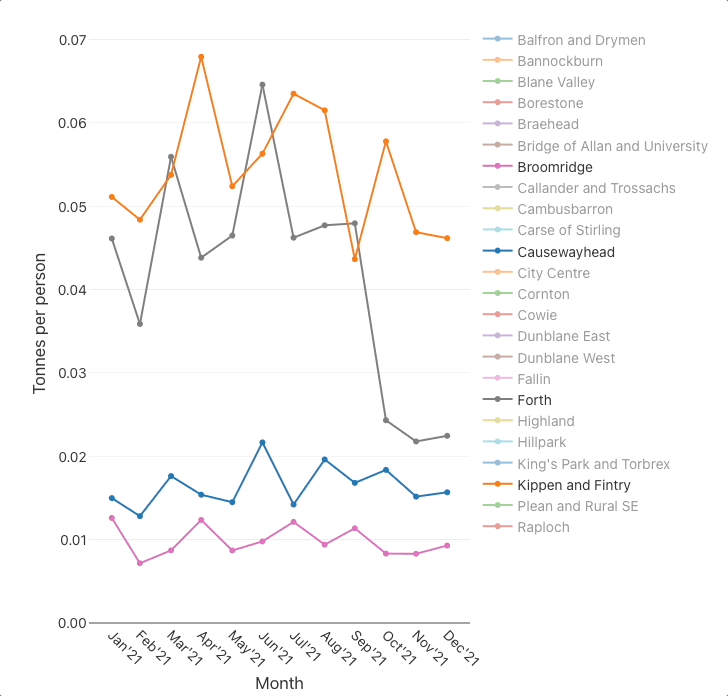
Plot the monthly per-person quantities
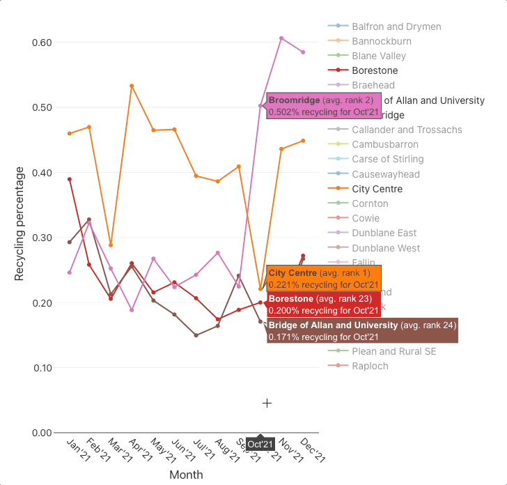
Plot the monthly recycling percentages
🤔 Conclusions
The charts suggest that there are substantial differences between some DataZones, for example:
- the
per-person quantitieschart indicates that there is roughly a ×3 difference between the best (Broomridge) and worst (Kippen and Fintry) DataZones, - and the
recycling percentageschart indicates that there is roughly a ×2 difference between the best (City Centre) and worst (Bridge of Allan and University) DataZones.
Are these differences real? Well, they are too significant to have arisen due to a few bad data points or mappings. Ok then, could the differences be due to systematic differences in the method used to categorise and measure bin collection quantities, between DataZones? That’s unlikely since many of the DataZones at both ends of the ranking share the same processing/measurement facility.
Most of the DataZones exhibit a step change in both charts around Aug'21–Nov'21 where (the majority of) the monthly quantities collected decrease and the recycling percentages increase.This coincides with Stirling council’s change to a four-weekly bin collection for grey bins (general waste) and blue bins (plastics, cartons & cans), and its Recycle 4 Stirling campaign. It’s understandable that that specific change to bin collections increased recycling percentages, but it doesn’t explain the decrease in monthly quantities. Perhaps there was also a change in the method of measurement/accounting, or that households took more of their waste to landfill sites themselves(!), or was it (at least partly) caused by the change in season?
It is good that Stirling council have begun to publish this data as Open Data into the public domain. It will open future, data-backed possibilities as it grows in volume and (hopefully) increases in fidelity. So, Stirling council, please keep on publishing the data (but make it more DataZone-friendly!).
