A presentation of our work on the Participatory Accounting of Social Impacts

A presentation of our work on the Participatory Accounting of Social Impacts (in Scotland) – PASI.

Click on the image below to open the presentation in your web browser, then use <, > or SPACE BAR to navigate through the slides (and s to see the speaker notes).

DCS PASI presentation title page screenshot

Data flow in the proof-of-concept implementation for PASI

We have been exploring the idea of building a platform for the Participatory Accounting of Social Impacts (in Scotland) – PASI.  Waste reduction is the social impact that we are focussing on for our proof-of-concept (PoC) implementation, and the diagram (below) shows the flow of waste reduction related data, through our PoC.

A few notes about this PoC:

  • Potentially any individual/organisaton can be a “participant” (a peer-actor) in the PASI information system. A participant might publish data into PASI’s open, distributed (RDF) data graph; or/and consume data from it.
    In our PoC, participants can…
  • Supply measurement/observational data (quantities, times, descriptions). E.g. the instances of reuse/recycling supplied by ACE, STCMF, FRSHR and STCIL.
  • Provide reference metrics (measuring and categorisation standards). E.g. the carbon impact metric provided by ZWS.
  • Contribute secondary data (joining data, secondary calculations). E.g. the source→reference mappings, and the  calculated standardised waste reduction data contributed by DCS.
  • Build apps which consume the data from the PASI information system. E.g. a webapp which provides a dashboard onto waste reduction, for the general public.
  • Directly use the data in the distributed PASI graph. E.g. a federated SPARQL query constructed by a data analyst.

Data flow in the PASI PoC

Building linked open data about carbon savings

linked open data for carbon savings

We have written a research report which walks through how we might build linked open data (LoD) about carbon savings from dissimilar data sources.

It outlines (using small samples from the datasets) how the data pipeline that feeds our prototype-6 webapp, works.

Building LoD about carbon savings - research report - coversheet

“How is waste in my area?” – a regional dashboard

Introduction

Our aim in this piece of work is:

to surface facts of interest (maximums, minimums, trends, etc.) about waste in an area, to non-experts.

Towards that aim, we have built a prototype regional dashboard which is directly powered by our ‘easier datasets’ about waste.

The prototype is a webapp and it can be accessed here.

our prototype regional dashboard

Curiosities

Even this early prototype manages to surface some curiosities [1] …​

Inverclyde

Inverclyde is doing well.

Inverclyde’s household waste positions Inverclyde’s household waste generation Inverclyde’s household waste CO2e

In the latest data (2019), it generates the fewest tonnes of household waste (per citizen) of any of the council areas. And its same 1st position for CO2e indicates the close relation between the amount of waste generated and its carbon impact.

…​But why is Inverclyde doing so well?

Highland

Highland isn’t doing so well.

Highland’s household waste positions Highland’s household waste generation Highland’s household waste % recycled

In the latest data (2019), it generates the most (except for Argyll & Bute) tonnes of household waste (per citizen) of any of the council areas. And it has the worst trend for percentage recycled.

…​Why is Highland’s percentage recycled been getting worse since 2014?

Fife

Fife has the best trend for household waste generation. That said, it still has been generating an above the average amount of waste per citizen.

Fife’s household waste positions Fife’s household waste generation

The graphs for Fife business waste show that there was an acute reduction in combustion wastes in 2016.

Fife’s business waste

We investigated this anomaly before and discovered that it was caused by the closure of Fife’s coal fired power station (Longannet) on 24th March 2016.

Angus

In the latest two years of data (2018 & 2019), Angus has noticibly reduced the amount of household waste that it landfills.

Angus' household waste management

During the same period, Angus has increased the amount household waste that it processes as ‘other diversion’.

…​What underlies that difference in Angus’ waste processing?

Technologies

This prototype is built as a ‘static’ website with all content-dynamics occurring in the browser. This makes it simple and cheap to host, but results in heavier, more complex web pages.

  • The clickable map is implemented on Leaflet – with Open Street Map map tiles.
  • The charts are constructed using Vega-lite.
  • The content-dynamics are coded in ClojureScript – with Hiccup for HTML, and Reagent for events.
  • The website is hosted on GitHub.

Ideas for evolving this prototype

  1. Provide more qualitative information. This version is quite quantitative because, well, that is nature of the datasets that currently underlay it. So there’s a danger of straying into the “managment by KPI” approach when we should be supporting the “management by understanding” approach.
  2. Include more localised information, e.g. about an area’s re-use shops, or bin collection statistics.
  3. Support deeper dives, e.g. so that users can click on a CO2e trend to navigate to a choropleth map for CO2e.
  4. Allow users to download any of the displayed charts as (CSV) data or as (PNG) images.
  5. Enhance the support of comparisons by allowing users to multi-select regions and overlay their charts.
  6. Allow users to choose from a menu, what chart/data tiles to place on the page.
  7. Provide a what-if? tool. “What if every region reduced by 10% their landfilling of waste material xyz?” – where the tool has a good enough waste model to enable it to compute what-if? outcomes.

1. One of the original sources of data has been off-line due to a cyberattack so, at the time of writing, it has not been possible to double-check all figures from our prototype against original sources.

The usefulness of putting datasets into Wikidata?

A week ago, I attended Ian Watt‘s workshop on Wikidata at the Scottish Open Data Unconference 2020. It was an interesting session and it got me thinking about how we might upload some our datasets of interest (e.g. amounts of waste generated & recycled per Scottish council area, ‘carbon impact’ figures) into Wikidata. Would having such datasets in Wikidata, be useful?

There is interest in “per council area” and “per citizen  waste data so I thought that I’d start by uploading into Wikidata, a dataset that describes the populations per Scottish council area per year (source: the Population Estimates data cube at statistics.gov.scot).

This executable notebook steps through the nitty-gritty of doing that. SPARQL is used to pull data from both Wikidata and statistics.gov.scot; the data is compared and the QuickStatements tool is used to help automate the creation and modification of Wikidata records. 2232 edits were executed against Wikidata through QuickStatements (taking about 30 mins). Unfortunately QuickStatements does not yet support a means to set the rank of a statement so I had to individually edit the 32 council area pages to mark, in each, its 2019 population value as the Preferred rank population value …​indicating that it is the most up-to-date population value.

But, is having this dataset in Wikidata useful?

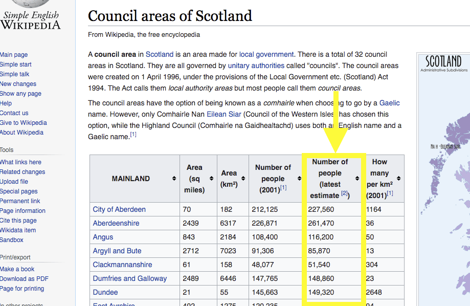
The uploaded dataset can be pulled (de-referenced) into Wikipedia articles quite easily. As an example, I edited the Wikipedia article Council areas of Scotland to insert into its main table, the new column “Number of people (latest estimate)” whose values are pulled (each time the page is rendered) directly from the data that I uploaded into Wikidata:

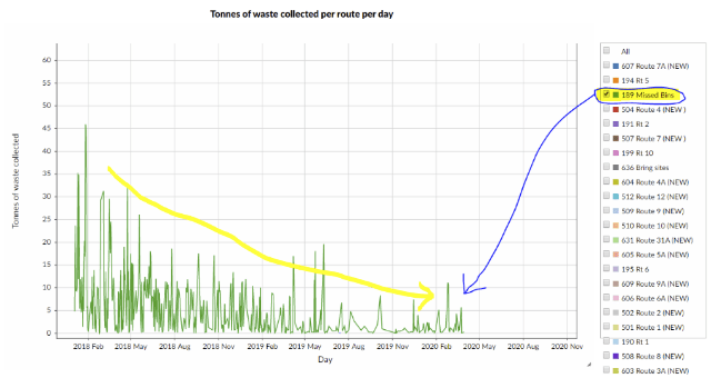
Visualisations based on the upload dataset can be embedded into web pages quite easily. Here’s an example that fetches our dataset from Wikidata and renders it as a line graph, when this web page is loaded into your web browser:


Concerns, next steps, alternative approaches.

Interestingly, there is some discussion about the pros & cons of inserting Wikidata values into Wikipedia articles. The main argument against is the immaturity of Wikidata’s structure: therefore a concern about the durability of the references into its data structure. The counter point is that early use & evolution might be the best path to maturity.

The case study for our Data Commons Scotland project, is open data about waste in Scotland. So a next step for the project might be to upload into Wikidata, datasets that describe the amounts of household waste generated & recycled, and ‘carbon impact’ figures. These could also be linked to council areas – as we have done for the population dataset – to support per council area/per citizen statistics and visualisations. Appropriate properties do not yet exist in Wikidata for the description of such data about waste, so new ones would need to be ratified by the Wikidata community.

Should such datasets actually be uploaded into Wikidata?…​These are small datasets and they seem to fit well enough into Wikidata’s knowledge graph. Uploading them into Wikidata may make them easier to access, de-silo the data and help enrich Wikidata’s knowledge graph. But then, of course, there is the keeping it up-to-date issue to solve. Alternatively, those datasets could be pulled dynamically and directly from statistics.gov.scot into Wikipedia articles with the help of some new MediaWiki extensions.


The geography of household waste generation

Working on his human geography homework, Rory asks…

Which areas in Scotland are reducing their household waste?

This week, in a step towards supporting the above scenario, I investigated how we might generate choropleths to help us visualise the variations in the amounts of household-generated waste across geographic areas in Scotland.

The cube-to-chart executable notebook steps through the nitty-gritty of this experiment. The steps include:

    1. Running a SPARQL query against statistics.gov.scot’s very useful data cubes to find the waste tonnage generated per council citizen per year.
    2. For each council area, derive the 3 values:
      • recent – 2018’s tonnage of waste generated per council citizen.
      • average – 2011-2018’s average (mean) tonnage of waste generated per council citizen.
      • trend – 2011-2018’s trend in tonnage of waste generated per council citizen. Each trend value is calculated as the gradient of a linear approximation to the tonnage over the years. (A statistician might well suggest a more appropriate method for computing this trend value.)

      The derived data can be seen in this file.

    3. Use Vega to generate 3 choropleths which help visualise the statistical values from the above step, against the council-oriented geography of Scotland. (The geography data comes from Martin Chorely’s good curation work.)

The resulting choropleths can be seen on >> this page <<

Rory looks at the “2011-2018 trend in tonnage” choropleth, and thinks…

It’s good to see that most areas are reducing waste generation but why not all…?

Looking at the “2018 tonnage” and 2011-2018 average tonnage” choropleths, Niamh wonders…

I wonder why urban populations seem to generate less waste than rural ones?

Stirling Council’s waste-management dataset as linked open data 

Kudos to Stirling Council for being the only Scottish local authority to have published household waste collection data as open data. This data is contained in their waste-management dataset. It consists of: 

  • Core dataper year CSV files 
  • Metadata that includes a basic schema for the CSV files, maintenance information and a descriptive narrative. 

For that, Stirling Council have attained 3 stars on this openness measure.  

To reach 5 stars, that data would have to be turned into linked open data, i.e. gain the following: 

  • URIs denoting things. E.g. have a URI for each waste type, each collection route and each measurement. 
  • Links to other data to provide context. E.g. reference commonly accepted identifiers/URIs for dates, waste types and route geographies. 

This week I investigated aspects of what would be involved in gaining those extra two stars

This executable notebook steps through the nitty-gritty of doing that. The steps include: 

  1. Mapping the data into the vocabulary for the statistical data cube structure – as defined by the W3C and used by the Scottish government’s statistic office. 
  2. Mapping the date values to the date-time related vocabulary – as defined by the UK government. 
  3. Defining placeholder vocabularies for waste type and collection routes. Future work would be to: map waste types to (possibly “rolled-up” values) in a SEPA defined vocabulary; and map collection routes to a suitable geographic vocabulary. 
  4. Converting the CSV source data into RDF data in accordance to the above mappings. This results in a set of .ttl – RDF Turtle syntax – files.  
  5. Loading the .ttl files into a triplestore database so that their linked data graph can be queried easily. 
  6. Running a few SPARQL queries against the triplestore to sanity-check the linked data graph. 
  7. Creating an example infographic (showing the downward trend in missing bins) from the linked data graph:  

 Conclusions 

  • It took a not insignificant amount of consideration to convert the 3-star non-linked data to (almost) 5-star linked data. But I expect that the effort involved will tail off if we similarly converted further datasets, because of the experience and knowledge gained along the way. 
  • Having a linked data version of the waste-management dataset promises to make its information more explicit and more compostable. But for the benefits to be fully realised, more cross-linking needs to be carried out. In particular, we need to map waste types to a common (say, SEPA controlled) vocabulary; and map collection routes to a common geographic vocabulary. 
  • We might imagine that if such a linked dataset were to be published & maintained – with other local authorities contributing data into it – then SEPA would be able to directly and constantly harvest its information so, making period report preparation unnecessary.  
  • JimT and I have discussed how the Open Data Phase2 project might push for the publication of linked open data about waste, using common vocabularies, and how our Data Commons Project could aim to fuel its user interface using that linked open data. In order words, the linked open data layer is where the two project meet.