Here’s a lightning demo of our proof-of-concept, PASI knowledge graph, being queried using SPARQL.

Here’s a lightning demo of our proof-of-concept, PASI knowledge graph, being queried using SPARQL.
On our requirements list is, to weave interest-based navigation maps through our data site. And feedback from the recent SODU 2021 conference, affirmed this:
I like the site’s tools and visualisations, but more needs to be done to help me navigate my path of interest through the prototype website.
In an exploratory step towards fulfilling that requirement, we have annotated some data points with explanations/narrative. The idea is that that these annotations could become waymarks in navigation maps, to guide users between the datapoints which underpin data-based stories. We might even imagine how clicking a ‘next’ button on a waymark would visually ‘fly’ the user to the next datapoint in the story (which is, perhaps, on a different graph or different page). But(!) back to our present, very simple proof-of-concept implementation…
Here’s how the annotations look in our present, proof-of-concept implementation:

Each annotation is depicted by an emoji which is plotted beside a datapoint (on a graph, or in a table). When the user hovers over (or clicks on) an annotation’s emoji, a pop-up will display some informative text.
We want to code annotations just as we would any other dataset – as a straighforward CSV file. So we have built a data-drive annotation mechanism. This has allowed us to specify annotations, as data, in a CSV file like this:

Each annotation record contains datapoint coordinates which specify the datapoint against which the annotation is to be plotted. The datapoint coordinates include a record-type which specifies the dataset against which the annotation is to be plotted. (In this example, the specified dataset household-waste-derivation-generation is a derived dataset, based on the household-waste and population datasets.)
This proof-of-concept, data-driven, annotation mechanism has been useful because it has:
given us a model with moving parts to learn from,
provided hints about how annotations can be used to help users understand and navigate the data,
shown us that we need more structure around the naming and storage of derived datasets (and their annotations), and
uncovered the difficultlies of retro-fitting an annotations mechanism into our prototype-6 website. (Annotations are displayed using off-the-shelf Vega-lite tooltips and Bulma CSS dropdowns, but these don’t provide a satisfactory level of placement/control/interactivity. More customised webpage components will be needed to provide a better user experience.)
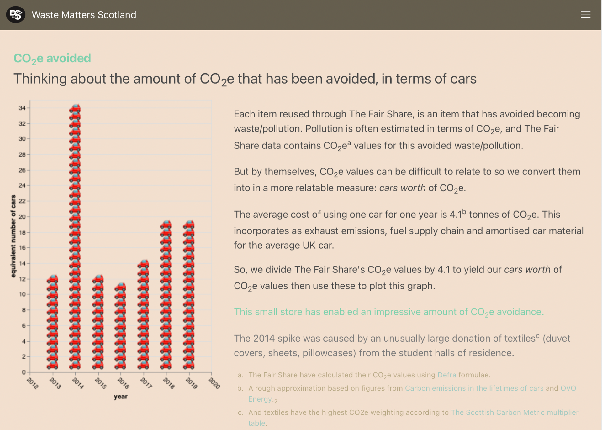
The Fair Share is a university based, reuse store. It accepts donations of second-hand books, clothes, kitchenware, electricals, etc. and sells these to students. It is run by the Student Union at the University of Stirling. It meets the Revolve quality standard for second-hand stores.
The Fair Share is in the process of publishing its data as open data. Click on the image below to see a web page that is based on an draft of that work.
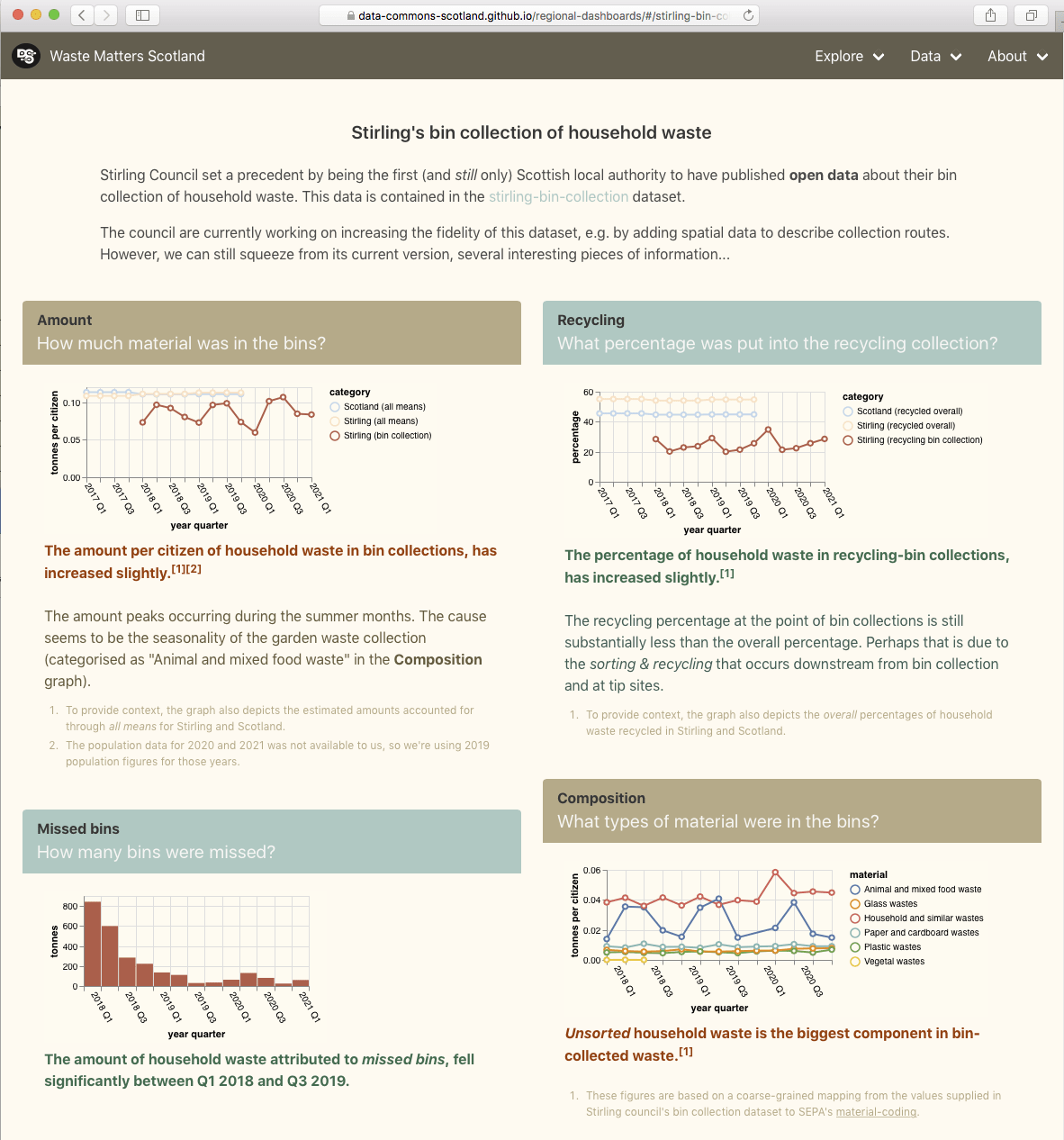
Stirling Council set a precedent by being the first (and still only) Scottish local authority to have published open data about their bin collection of household waste.
The council are currently working on increasing the fidelity of this dataset, e.g. by adding spatial data to describe collection routes. However, we can still squeeze from its current version, several interesting pieces of information. For details, visit the Stirling bin collection page on our website mockup.
Our aim in this piece of work is:
to surface facts of interest (maximums, minimums, trends, etc.) about waste in an area, to non-experts.
Towards that aim, we have built a prototype regional dashboard which is directly powered by our ‘easier datasets’ about waste.
The prototype is a webapp and it can be accessed here.

Even this early prototype manages to surface some curiosities [1] …
Inverclyde is doing well.


In the latest data (2019), it generates the fewest tonnes of household waste (per citizen) of any of the council areas. And its same 1st position for CO2e indicates the close relation between the amount of waste generated and its carbon impact.
…But why is Inverclyde doing so well?
Highland isn’t doing so well.


In the latest data (2019), it generates the most (except for Argyll & Bute) tonnes of household waste (per citizen) of any of the council areas. And it has the worst trend for percentage recycled.
…Why is Highland’s percentage recycled been getting worse since 2014?
Fife has the best trend for household waste generation. That said, it still has been generating an above the average amount of waste per citizen.


The graphs for Fife business waste show that there was an acute reduction in combustion wastes in 2016.

We investigated this anomaly before and discovered that it was caused by the closure of Fife’s coal fired power station (Longannet) on 24th March 2016.
In the latest two years of data (2018 & 2019), Angus has noticibly reduced the amount of household waste that it landfills.

During the same period, Angus has increased the amount household waste that it processes as ‘other diversion’.
…What underlies that difference in Angus’ waste processing?
This prototype is built as a ‘static’ website with all content-dynamics occurring in the browser. This makes it simple and cheap to host, but results in heavier, more complex web pages.
SEPA publish a “Site returns” dataset (accessible via their Waste sites and capacity tool) that says…
Here is an extract…

This is impressive, ongoing data collection and curation by SEPA.
But might some of its information be made more understandable to the general public by depicting it on a map?
Towards answering that, we built a prototype webapp. (For speed of development, we considered only the materials incoming to waste sites during the year 2019.)
To aid comprehension, SEPA often sorts waste materials into 33 categories. We do the same in our prototype, mapping each EWC coded waste material into 1 of the 33 categories…

The “Site returns” dataset identifies waste sites by their Permit/Licence code. We want our prototype to show additional information about each waste site. Specifically, its name, council area, waste processing activities, client types, and location – very important for our prototype’s map-based display!
SEPA holds that additional information about waste sites, in a 2nd dataset: “Waste sites and capacity summary” (also accessible via their Waste sites and capacity tool). Our prototype uses the Permit/Licence codes to cross-reference between the 2 SEPA datasets.
SEPA provides the waste site locations as National Grid eastings and northings. However, it is easier to use latitude & longitude coordinates in our chosen map display technology so, our prototype uses Colantoni’s library to perform the conversion.
A ‘live’ instance of the resulting prototype webapp can be accessed here.
Below is an animated image of it…

 Depicts a single waste site.
 Depicts an aggregation of 26 waste sites.
 (I.e. a number without a surrounding pie chart) depicts a waste site with no incoming materials (probably because the site was not operational during 2019).
 Hovering the cursor over a pie segment will pop-up details about incoming tonnes of the material depicted by the segment.
 Hovering the cursor over a pie that depicts an aggregation will highlight the map area in which the aggregated waste sites are located.
 Clicking on a single waste site will pop-up details about that waste site.
 Clicking on ‘attributions’ will display a page that credits:
But might some of its information be made more understandable to the general public by depicting it on a map?
For any good solution, the answer will be an obvious ‘yes’. But what about for our prototype webapp solution?…
We think that it could help pique interest in the differences in the amounts & types of waste materials that are being disposed in different areas of the country. For example…
 |
Glancing at our prototype’s map (image left; at the default zoom level), the seemingly disproportionate amount of soils & stones coming into north west Scotland waste sites catches our attention. So we zoom in (right image) to find that almost all of it is accounted for by one landfill site on the the Isle of Lewis. |
 |
Future work could increase the utility of this prototype webapp by:
When I watched the waste amounts change through time on this map, Fife’s amounts really stood out…

Fife was generating so much more waste from business, than the other council areas. But why?
To look at the data in more detail, I loaded it into the data grid & graph tool that we built a couple of months ago.
First, I filtered the data grid to show me: Fife’s four largest, business wastes vs their averages link.

Fife’s combustion waste stands out from the average.
Secondly, I filtered the data grid to show me: the business combustion waste quantities by sector link.

Unfortunately this data isn’t broken down by council area, but it clearly shows that most of the combustion wastes are generated by the power industry.
An internet search with this information – i.e. “Fife combustion power” – returns a page full of references to Longannet – the coal fuelled power station.

According to Wikipedia, Longannet power station was the 21st most polluting in Europe when it closed, so no wonder that its signature in the data is so obvious! It was closed on 24th March 2016, which correlates with the sharp return towards the average in 2016, of the combustion wastes graph line for Fife.
Of course this isn’t a real discovery – SEPA, Scottish Power and the people who lived around the power station will be very familiar with this data anomaly and its cause. But I think that its mildly interesting that a data lay person like me could discover this from looking at these simple data visualisations.
Shortly before the end of 2020, I attended the Code The City 21: Put Your City on the Map hack weekend which explored ideas for putting open data onto geographic maps.
It ran several interesting projects. There was one was especially inspiring to me: the Bioregion Dashboard. Its idea is to tell an evidence-backed story-through-the-years, involving interactive data displays against a map. James Littlejohn introduces it in this YouTube video.
This got me thinking about new ways to depict the information that is bound up in the data about waste…
In particular, thinking about a means to convey at-a-glance, to the lay person, how councils areas compare through time in respect of the amounts of (household solid) waste that they process. Now, the grid & graph prototype that we built a couple of months back, conveys that same information very well (and with a greater fidelity than we will mange in this work) but, to the lay parson like me, it isn’t attention grabbing. I like seeing something with movement and with features that I can relate to, such as animated charts and a geographical map.
Leveraging what I learnt at the Code the City 21 hack weekend, I hacked together a prototype webapp that shows how waste quantities change through time, on a geographic map.
The below, animated image of the webapp, it conveys that landfilled-waste is reducing over time whilst total-waste is remaining fairly constant.

 control, either:
 control to travel through time.
 chart depicts the waste-related quantities for a council area.
 panel.
A ‘live’ instance of this webapp can be accessed here .
I haven’t seen these datasets about waste shown in this way before, and I think that it usefully conveys aspects of the datasets in a catchy and easy to understand way. It is low fidelity when compared to a full data grid with graph solution, but the idea is to hold the attention of the average person in the street.
Future work could integrate additional waste-relevant datasets that have geography and time dimensions. Also we should consider alternative metrics (such as ratios), alternative charts (such as bar or polar) and alternative statistics (such as deviation or trend). I went with the ‘most straightforward’ but user-testing might indicate that an alternative is better.
The interactive data grid with a linked graph is a tool that is often used to aggregate, dissect, explore, compare & visualise datasets. Might such a tool help our users explore and understand open data about waste? To help answer this, I have hacked together a web-based prototype…
The working prototype can be accessed via this link.
The prototype pulls together 4 datasets:
The datasets are fetched from statistics.gov.scot and Wikidata, using SPARQL; then matched; and finally, the per-citizen and per-household values are calculated.
The result is 17,490 data records.
The data was assembled using this executable Jupyter notebook. For a production-class implementation, that could easily be coded as automated, periodic process.
The web app containing the interactive data grid with a linked graph, was built using the DevExtreme web component library. Alternative libraries are viable, but the DevExtreme one is modern and free for non-commercial use.
The resulting data assembly and web app are stored as static files in the project’s GitHub repositories.
The prototype’s web page contains a graph and a configurable data grid. The graph automatically reflects the data selected in the data grid.

Detailed information about a graph’s data point is shown when the user hovers over it with the cursor.

The graph can be zoomed/unzoomed, and its current contents can be printed or saved as PNG, PDF, etc.

The data grid’s expand/collapse arrow-head icons allow the user to drilldown into slices of data. Below, we’ve expanded the Stirling → Recycled slice to reveal the data values per-material.

The data grid’s “Show Filed Chooser” icon pops up a control panel to allow the user to select data dimensions, axis assignments, value ranges, value filters, display order, etc., etc.

The data grid’s “Export to Excel file” icon will export the grid’s currently selected data to an Excel spreadsheet.
The resulting Excel files are nice because the export functionality preserves user-friendly fixed headers and some other formatting.

Finally, the prototype operates well on phones and tablets (although there is a sizing issue with pop-up panels that I haven’t investigated).


So, might (a production-class version of) such a tool, help our users to explore and understand open data about waste? Well, we won’t know until we have user tested it, but my guess is that:
A presets feature has been added to the tool so that users can go to a particular configuration & data selection by simply clicking on a hyperlink. This supports an easy-access route to the tool for users with no data analysis experience, by answering their potential questions through presets such as:
A week ago, I attended Ian Watt‘s workshop on Wikidata at the Scottish Open Data Unconference 2020. It was an interesting session and it got me thinking about how we might upload some our datasets of interest (e.g. amounts of waste generated & recycled per Scottish council area, ‘carbon impact’ figures) into Wikidata. Would having such datasets in Wikidata, be useful?
There is interest in “per council area” and “per citizen“ waste data so I thought that I’d start by uploading into Wikidata, a dataset that describes the populations per Scottish council area per year (source: the Population Estimates data cube at statistics.gov.scot).
This executable notebook steps through the nitty-gritty of doing that. SPARQL is used to pull data from both Wikidata and statistics.gov.scot; the data is compared and the QuickStatements tool is used to help automate the creation and modification of Wikidata records. 2232 edits were executed against Wikidata through QuickStatements (taking about 30 mins). Unfortunately QuickStatements does not yet support a means to set the rank of a statement so I had to individually edit the 32 council area pages to mark, in each, its 2019 population value as the Preferred rank population value …indicating that it is the most up-to-date population value.
But, is having this dataset in Wikidata useful?
The uploaded dataset can be pulled (de-referenced) into Wikipedia articles quite easily. As an example, I edited the Wikipedia article Council areas of Scotland to insert into its main table, the new column “Number of people (latest estimate)” whose values are pulled (each time the page is rendered) directly from the data that I uploaded into Wikidata: 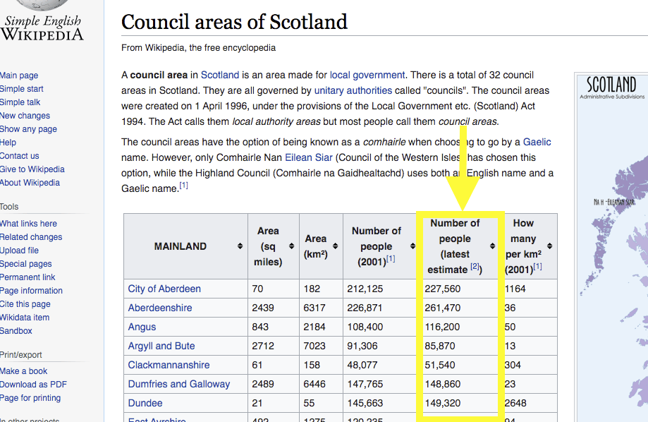
Visualisations based on the upload dataset can be embedded into web pages quite easily. Here’s an example that fetches our dataset from Wikidata and renders it as a line graph, when this web page is loaded into your web browser:
Concerns, next steps, alternative approaches.
Interestingly, there is some discussion about the pros & cons of inserting Wikidata values into Wikipedia articles. The main argument against is the immaturity of Wikidata’s structure: therefore a concern about the durability of the references into its data structure. The counter point is that early use & evolution might be the best path to maturity.
The case study for our Data Commons Scotland project, is open data about waste in Scotland. So a next step for the project might be to upload into Wikidata, datasets that describe the amounts of household waste generated & recycled, and ‘carbon impact’ figures. These could also be linked to council areas – as we have done for the population dataset – to support per council area/per citizen statistics and visualisations. Appropriate properties do not yet exist in Wikidata for the description of such data about waste, so new ones would need to be ratified by the Wikidata community.
Should such datasets actually be uploaded into Wikidata?…These are small datasets and they seem to fit well enough into Wikidata’s knowledge graph. Uploading them into Wikidata may make them easier to access, de-silo the data and help enrich Wikidata’s knowledge graph. But then, of course, there is the keeping it up-to-date issue to solve. Alternatively, those datasets could be pulled dynamically and directly from statistics.gov.scot into Wikipedia articles with the help of some new MediaWiki extensions.