Waste sites and the quantities of incoming materials

The dataset

SEPA publish a “Site returns” dataset (accessible via their Waste sites and capacity tool) that says…​

  • how many tonnes
  • of each (EWC coded) waste material
  • was moved in or out
  • of each authorised waste site in Scotland.

Here is an extract…​

SEPA Site returns sample

This is impressive, ongoing data collection and curation by SEPA.

But might some of its information be made more understandable to the general public by depicting it on a map?

Towards answering that, we built a prototype webapp. (For speed of development, we considered only the materials incoming to waste sites during the year 2019.)

Data mapping

To aid comprehension, SEPA often sorts waste materials into 33 categories. We do the same in our prototype, mapping each EWC coded waste material into 1 of the 33 categories…​

33 materials, categorised

The “Site returns” dataset identifies waste sites by their Permit/Licence code. We want our prototype to show additional information about each waste site. Specifically, its name, council area, waste processing activities, client types, and location – very important for our prototype’s map-based display!

SEPA holds that additional information about waste sites, in a 2nd dataset: “Waste sites and capacity summary” (also accessible via their Waste sites and capacity tool). Our prototype uses the Permit/Licence codes to cross-reference between the 2 SEPA datasets.

SEPA provides the waste site locations as National Grid eastings and northings. However, it is easier to use latitude & longitude coordinates in our chosen map display technology so, our prototype uses Colantoni’s library to perform the conversion.

The prototype webapp

A ‘live’ instance of the resulting prototype webapp can be accessed here.

Below is an animated image of it…​

our prototype webapp

UI & controls

  • Each pie chart depicts the amounts of materials incoming to a single waste site, or the aggregation of waste sites within a map area.
    • single waste site pie Depicts a single waste site.
    • multiple waste sites pie Depicts an aggregation of 26 waste sites.
  • no pie (I.e. a number without a surrounding pie chart) depicts a waste site with no incoming materials (probably because the site was not operational during 2019).
  • material details pop-up Hovering the cursor over a pie segment will pop-up details about incoming tonnes of the material depicted by the segment.
  • area highlighting Hovering the cursor over a pie that depicts an aggregation will highlight the map area in which the aggregated waste sites are located.
  • waste site pop-up Clicking on a single waste site will pop-up details about that waste site.
  • zoom control The webapp supports the usual zoom and pan controls. The user can also double-click on an aggregation pie to zoom into the area that it covers.
  • attributions Clicking on ‘attributions’ will display a page that credits:

Closing thoughts

But might some of its information be made more understandable to the general public by depicting it on a map?

For any good solution, the answer will be an obvious ‘yes’. But what about for our prototype webapp solution?…​

We think that it could help pique interest in the differences in the amounts & types of waste materials that are being disposed in different areas of the country. For example…​

splash view

Glancing at our prototype’s map (image left; at the default zoom level), the seemingly disproportionate amount of soils & stones coming into north west Scotland waste sites catches our attention.

So we zoom in (right image) to find that almost all of it is accounted for by one landfill site on the the Isle of Lewis.

Bennadrove landfill site

Future work could increase the utility of this prototype webapp by:

  • allowing the user to browse over the time-series aspect of this dataset using a time slider control (like our through time on a map prototype)
  • providing a means to switch the focus of interest from incoming material to: outgoing material, processing activities (landfill, composting, metal recycling, etc.), or facilities offered (household, commercial, special disposals, etc.)
  • supporting filtering over the various dimensions
  • providing the means for a user to open their current data selection in a tool (like our data grid & graph prototype) that allows them to explore the data in more detail.

How I chanced on Longannet in the data

I’ve added a “Household vs business waste” time-series to our map-oriented webapp from last week. The business data was parsed from SEPA’s Business Waste Data Tables.

When I watched the waste amounts change through time on this map, Fife’s amounts really stood out…​

Household vs business waste, thru time

Fife was generating so much more waste from business, than the other council areas. But why?

To look at the data in more detail, I loaded it into the data grid & graph tool that we built a couple of months ago.

First, I filtered the data grid to show me: Fife’s four largest, business wastes vs their averages link.

Fife’s four largest, business wastes vs their averages

Fife’s combustion waste stands out from the average.

Secondly, I filtered the data grid to show me: the business combustion waste quantities by sector link.

Business combustion wastes by sector

Unfortunately this data isn’t broken down by council area, but it clearly shows that most of the combustion wastes are generated by the power industry.

An internet search with this information – i.e. “Fife combustion power” – returns a page full of references to Longannet – the coal fuelled power station.

Longannet power station (courtesy of Scottish Power)

According to Wikipedia, Longannet power station was the 21st most polluting in Europe when it closed, so no wonder that its signature in the data is so obvious! It was closed on 24th March 2016, which correlates with the sharp return towards the average in 2016, of the combustion wastes graph line for Fife.

Of course this isn’t a real discovery – SEPA, Scottish Power and the people who lived around the power station will be very familiar with this data anomaly and its cause. But I think that its mildly interesting that a data lay person like me could discover this from looking at these simple data visualisations.

Waste quantities through time, on a map

Preface

Shortly before the end of 2020, I attended the Code The City 21: Put Your City on the Map hack weekend which explored ideas for putting open data onto geographic maps.

It ran several interesting projects. There was one was especially inspiring to me: the Bioregion Dashboard. Its idea is to tell an evidence-backed story-through-the-years, involving interactive data displays against a map. James Littlejohn introduces it in this YouTube video.

This got me thinking about new ways to depict the information that is bound up in the data about waste…​

In particular, thinking about a means to convey at-a-glance, to the lay person, how councils areas compare through time in respect of the amounts of (household solid) waste that they process. Now, the grid & graph prototype that we built a couple of months back, conveys that same information very well (and with a greater fidelity than we will mange in this work) but, to the lay parson like me, it isn’t attention grabbing. I like seeing something with movement and with features that I can relate to, such as animated charts and a geographical map.

The prototype webapp

Leveraging what I learnt at the Code the City 21 hack weekend, I hacked together a prototype webapp that shows how waste quantities change through time, on a geographic map.

The below, animated image of the webapp, it conveys that landfilled-waste is reducing over time whilst total-waste is remaining fairly constant.

Managed solid waste, through time

UI controls

  • The dataset of interest is chosen through the dropdown control, either:
    1. Tonnes of managed solid household waste per person per year.
    2. Tonnes of C02 equivalent from household waste per person per year.
  • Use the slider control to travel through time.
  • Each pie chart depicts the waste-related quantities for a council area.
    • The sizes of its slices and its overall size, are related to the quantities that it depicts.
  • Hover over a council area to see detailed metrics in the detail panel.
  • The usual map zoom and pan controls are supported.

Software and datasets

CO2 equivalent

‘Live’ instance

A ‘live’ instance of this webapp can be accessed here .

Closing thoughts

I haven’t seen these datasets about waste shown in this way before, and I think that it usefully conveys aspects of the datasets in a catchy and easy to understand way. It is low fidelity when compared to a full data grid with graph solution, but the idea is to hold the attention of the average person in the street.

Future work could integrate additional waste-relevant datasets that have geography and time dimensions. Also we should consider alternative metrics (such as ratios), alternative charts (such as bar or polar) and alternative statistics (such as deviation or trend). I went with the ‘most straightforward’ but user-testing might indicate that an alternative is better.

Trialling Wikibase for our data layer

Introduction

The architectural proposal for our WCS platform, contains a data layer for collecting, linking, caching and making accessible the source datasets…​

bilayered architecture
Note
Our assumption is that, for our near-term aims, linked data provides the most useful foundation.


The idea that we’re trialling here, is to use Wikibase as the core component in our data layer…​

implementation using wikibase

The case for using Wikibase

Wikibase is a proven off-the-shelf solution that makes it easier to work with linked data. It provides:

  • A linked data store.
  • An interface for humans to view and manually edit linked data.
  • An API that can be used by computer programs to (bulk) edit linked data.
  • SPARQL support.

So why not just use Wikidata? (Wikidata is Wikibase’s common, public instance.) …​Ideally we would but:

  • Our domain specifics aren’t supported in Wikidata.
    • E.g. Wikidata doesn’t (yet) have a full vocabulary to describe waste management.
    • We want to experiment and move fast. Wikidata is sensibly cautious about change, therefore too slow for us.
  • We can still make use of Wikidata for some aspects of our work by referencing its data, using its vocabulary, and using it to store very general data.

Novelty…​  The use of a customised Wikibase instance is not novel but our intended specific customisation and application does have some novelty:

  • Wikibase provides easier to use, human-friendly access to linked data than typical triple stores.

    Will this facilitate more engagement and use, compared with sites with less human-oriented surface area? …Perhaps a worthwhile study.

    Also, the greater human-oriented surface area in this solution, should be direct help when it comes to implementing user-based features such as a recommender system and community forums.

  • By their nature, wiki solutions support crowd sourcing.

    Our platform could support a limited form of this by encouraging councils, recycling shops, etc. to contribute their data about waste; data which currently isn’t open or linked.

  • Our platform will be built using open & inexpensive (often free) components and services.

    It should be straightforward to apply the approach to other domains of open data for Scotland.

Hosting on WBStack

WBStack is an alpha (software-as-a-service) platform created by by Adam Shorland. It allows invitees to create their own, publicly accessible Wikibase instances.

Adam invited us to create our own Wikibase instance on his platform.
Our Wikibase is at https://waste-commons-scotland.wiki.opencura.com

screenshot wcs wikibase

Populating our Wikibase with data about waste

The datasets

In this trial, we want to populate our Wikibase with 4 datasets:

  1. area – reference data describing administrative areas
  2. population – reference data describing populations
  3. household waste – describing the tonnes of solid waste generated by households
  4. co2e – describing the tonnes of carbon equivalent from household waste

The data model

Representing a dataset record in Wikibase

Let’s consider a couple of records from the population dataset:

Aberdeen City 2018 227,560
Aberdeen City 2017 228,800

In Wikbase, we could represent each of those records as a statement on the “Aberdeen City “item. This is the approach that we took in our previous work about The usefulness of putting datasets into Wikidata?. This screenshot shows the resulting Wikidata statements …​

screenshot population statements wikidata

The problem with this approach is that it can result in an unwieldy amount of statements per single item.

The alternative approach we’ve taken for our Wikibase, is to represent each of those records as an item in its own right. So that first record is represented as the Wikibase item…​

screenshot popAc2018 wikibase

Some predicates and dimensions are common, they are used across most of the datasets.

Some predicates and dimensions are dataset specific. For example: the predicate has UK government code is used only to describe the area dataset; while the dimension end-state is used only to describe the household waste dataset.

Loading the data

I’ve hacked together a software script – dcs-wdt – which writes the datasets into our Wikibase. It is very rough’n’ready (however, it might be the seed of something more generic for automatically re-loading our datasets of interest). Its outline is:

/* order datasets & dataset-aspects, most independent first */
for each dataset in [base, area, population, household-waste, co2e]
  for each dataset-aspect in [class-item, predicates, supporting-dimensions, measurements]
    for each record in the dataset-aspect
      if the record is not already represented in the Wikibase
        write-to-wikibase a property or item to represent the record

Assessment

So, should we use a Wikibase as the core component in our data layer?

Pros

  • The bundled SPARQL query service and UI work well.

    There is an oddity w.r.t. implicit prefixes but this can be worked around by explicitly declaring the prefixes.

  • It has straight out-of-the-box search functionality which automatically indexes content, and provides a search feature (with ‘completion-suggestion’).
    screenshot search wikibase

    It is primarily configured for searching items by their labels but it does fall-through to providing a more full-text type search capability.

  • It has a baked-in API (in addition to the programmatically accessible SPARQL query service) which provides a very full and well documented HTTP-based API for reading & writing data.

    (The dcs-wdt script makes use of both its SPARQL query service and API.)

  • Its human-oriented web pages (UI) are sort of nice – making it easy to explore the data, and to perform data management tasks.
  • It comes with a raft of features for supporting community-contributed content, including: user accounts and permissions, discussion forums, and easy-ish to use bulk data uploads via QuickStatements. I haven’t explored these in any depth, but they are potentially useful if the project decides that supporting user content on the WCS platform, is in-scope.

Cons

  • It doesn’t come with all the bells’n’whistles I thought it would…​

    I think that I’ve been naive in thinking that many of the easy-to-use MediaWiki rendering features (especially over SPARQL queries) that I’ve read about (particularly those of LinkedWiki), would just-be-there. Unfortunately those are all extras…​the LinkedWiki extension and its transitive dependencies need to be installed; the relevant templates imported; OpenStreetMap etc. access keys must be configured.

    Those bells’n’whistles are not supported by WBStack and the installation of them would take some expertise.

  • WbStack’s service has been running for one year now but, as a free alpha, it provides no guarantees.

    For example, a recent update of some of its software stack caused a short outage and an ongoing problem with label rendering on our Wikibase instance.

Conclusions

For the project, the main reason for using Wikibase is two-fold:

  1. Out-of-the-box support for a simple linked data model that can be SPARQL-ed.
  2. The use of the wiki’s data-table, graphing & mapping widgets for the rapid prototyping of and inclusion in WCS web pages.

As it stands, the WBStack Wikibase is useful for (a) but not (b).

I’m thinking that we should keep it on the back burner for now – while we find out what the front-end needs. Its support of (a) might turn out to be a good enough reason to use it, although there are alternatives – including use of a standalone triple store; or, if we have just a few datasets, building our own linking software and file-based store. Not having (b) means extra work for us to build/configure widgets for graphing, mapping, etc.

A prototype data grid & graph over data about waste

The interactive data grid with a linked graph is a tool that is often used to aggregate, dissect, explore, compare & visualise datasets. Might such a tool help our users explore and understand open data about waste? To help answer this, I have hacked together a web-based prototype…​

The working prototype

The working prototype can be accessed via this link.

The data

The prototype pulls together 4 datasets:

  1. “Generation and Management of Household Waste” (SEPA).
  2. “Carbon footprint [CO2e]” (SEPA)..
  3. “Population Estimates (Current Geographic Boundaries)” (NRS).
  4. “Mid-Year Household Estimates” (NRS).

The datasets are fetched from statistics.gov.scot and Wikidata, using SPARQL; then matched; and finally, the per-citizen and per-household values are calculated.

The result is 17,490 data records.

The build

The data was assembled using this executable Jupyter notebook. For a production-class implementation, that could easily be coded as automated, periodic process.

The web app containing the interactive data grid with a linked graph, was built using the DevExtreme web component library. Alternative libraries are viable, but the DevExtreme one is modern and free for non-commercial use.

The resulting data assembly and web app are stored as static files in the project’s GitHub repositories.

Its features

The prototype’s web page contains a graph and a configurable data grid. The graph automatically reflects the data selected in the data grid.

700

Detailed information about a graph’s data point is shown when the user hovers over it with the cursor.

screenshot graph hover

The graph can be zoomed/unzoomed, and its current contents can be printed or saved as PNG, PDF, etc.

screenshot graph saving

The data grid’s expand/collapse arrow-head icons allow the user to drilldown into slices of data. Below, we’ve expanded the Stirling → Recycled slice to reveal the data values per-material.

screenshot drilldown

The data grid’s “Show Filed Chooser” icon pops up a control panel to allow the user to select data dimensions, axis assignments, value ranges, value filters, display order, etc., etc.

50
screenshot field chooser panel

The data grid’s “Export to Excel file” icon will export the grid’s currently selected data to an Excel spreadsheet.

50

The resulting Excel files are nice because the export functionality preserves user-friendly fixed headers and some other formatting.

700

Finally, the prototype operates well on phones and tablets (although there is a sizing issue with pop-up panels that I haven’t investigated).

200
400

But, is it useful?

So, might (a production-class version of) such a tool, help our users to explore and understand open data about waste? Well, we won’t know until we have user tested it, but my guess is that:

  1. users with no data analysis experience will find its configurability difficult to navigate.
  2. users with low-to-medium data analysis experience may find it a useful as a single tool containing multiple datasets.
  3. users with medium-to-high data analysis experience will prefer to use their own tools.

presets feature has been added to the tool so that users can go to a particular configuration & data selection by simply clicking on a hyperlink. This supports an easy-access route to the tool for users with no data analysis experience, by answering their potential questions through presets such as:

The usefulness of putting datasets into Wikidata?

A week ago, I attended Ian Watt‘s workshop on Wikidata at the Scottish Open Data Unconference 2020. It was an interesting session and it got me thinking about how we might upload some our datasets of interest (e.g. amounts of waste generated & recycled per Scottish council area, ‘carbon impact’ figures) into Wikidata. Would having such datasets in Wikidata, be useful?

There is interest in “per council area” and “per citizen  waste data so I thought that I’d start by uploading into Wikidata, a dataset that describes the populations per Scottish council area per year (source: the Population Estimates data cube at statistics.gov.scot).

This executable notebook steps through the nitty-gritty of doing that. SPARQL is used to pull data from both Wikidata and statistics.gov.scot; the data is compared and the QuickStatements tool is used to help automate the creation and modification of Wikidata records. 2232 edits were executed against Wikidata through QuickStatements (taking about 30 mins). Unfortunately QuickStatements does not yet support a means to set the rank of a statement so I had to individually edit the 32 council area pages to mark, in each, its 2019 population value as the Preferred rank population value …​indicating that it is the most up-to-date population value.

But, is having this dataset in Wikidata useful?

The uploaded dataset can be pulled (de-referenced) into Wikipedia articles quite easily. As an example, I edited the Wikipedia article Council areas of Scotland to insert into its main table, the new column “Number of people (latest estimate)” whose values are pulled (each time the page is rendered) directly from the data that I uploaded into Wikidata:

Visualisations based on the upload dataset can be embedded into web pages quite easily. Here’s an example that fetches our dataset from Wikidata and renders it as a line graph, when this web page is loaded into your web browser:


Concerns, next steps, alternative approaches.

Interestingly, there is some discussion about the pros & cons of inserting Wikidata values into Wikipedia articles. The main argument against is the immaturity of Wikidata’s structure: therefore a concern about the durability of the references into its data structure. The counter point is that early use & evolution might be the best path to maturity.

The case study for our Data Commons Scotland project, is open data about waste in Scotland. So a next step for the project might be to upload into Wikidata, datasets that describe the amounts of household waste generated & recycled, and ‘carbon impact’ figures. These could also be linked to council areas – as we have done for the population dataset – to support per council area/per citizen statistics and visualisations. Appropriate properties do not yet exist in Wikidata for the description of such data about waste, so new ones would need to be ratified by the Wikidata community.

Should such datasets actually be uploaded into Wikidata?…​These are small datasets and they seem to fit well enough into Wikidata’s knowledge graph. Uploading them into Wikidata may make them easier to access, de-silo the data and help enrich Wikidata’s knowledge graph. But then, of course, there is the keeping it up-to-date issue to solve. Alternatively, those datasets could be pulled dynamically and directly from statistics.gov.scot into Wikipedia articles with the help of some new MediaWiki extensions.


The geography of household waste generation

Working on his human geography homework, Rory asks…

Which areas in Scotland are reducing their household waste?

This week, in a step towards supporting the above scenario, I investigated how we might generate choropleths to help us visualise the variations in the amounts of household-generated waste across geographic areas in Scotland.

The cube-to-chart executable notebook steps through the nitty-gritty of this experiment. The steps include:

    1. Running a SPARQL query against statistics.gov.scot’s very useful data cubes to find the waste tonnage generated per council citizen per year.
    2. For each council area, derive the 3 values:
      • recent – 2018’s tonnage of waste generated per council citizen.
      • average – 2011-2018’s average (mean) tonnage of waste generated per council citizen.
      • trend – 2011-2018’s trend in tonnage of waste generated per council citizen. Each trend value is calculated as the gradient of a linear approximation to the tonnage over the years. (A statistician might well suggest a more appropriate method for computing this trend value.)

      The derived data can be seen in this file.

    3. Use Vega to generate 3 choropleths which help visualise the statistical values from the above step, against the council-oriented geography of Scotland. (The geography data comes from Martin Chorely’s good curation work.)

The resulting choropleths can be seen on >> this page <<

Rory looks at the “2011-2018 trend in tonnage” choropleth, and thinks…

It’s good to see that most areas are reducing waste generation but why not all…?

Looking at the “2018 tonnage” and 2011-2018 average tonnage” choropleths, Niamh wonders…

I wonder why urban populations seem to generate less waste than rural ones?

Increasing this project’s on-line presence

This project needs more presence on-line. Thanks for prompting this Ian! (And be sure to read Ian’s posting on the state of open data.) So, this week…

  • Anna & I have made a start on revamping this, the project’s public WordPress site, which Anna created late last year. This site is accessible at https://campuspress.stir.ac.uk/datacommonsscotland. The idea is that we’ll publish on it limited-lifespan information such as relevant happenings & blog postings and take feedback comments.
  • Also, I’ve create a public GitHub site at https://github.com/data-commons-scotland for some of the project’s longer-lifespan outputs such as concepts/models, standards, research output and open source code. GitHub will continue to preserve these (hopefully useful) outputs beyond the lifespan of this project. I’ve made a start by adding some investigation reports (dcs-shorts) and example web application source code (dcs-wcs).

Mocking-up features in a placeholder WCS web application

The narratives in Anna and Hannah’s Scenariosdocument, tantalise with mentions of the features supported by their fictional Waste Commons Scotland (WCS) web application. This week, mocked versions of some of those features have been added to the placeholder WCS web application (source code) – with the idea that their animation will make the features easier to understand and assess. 

Stirling Council’s waste-management dataset as linked open data 

Kudos to Stirling Council for being the only Scottish local authority to have published household waste collection data as open data. This data is contained in their waste-management dataset. It consists of: 

  • Core dataper year CSV files 
  • Metadata that includes a basic schema for the CSV files, maintenance information and a descriptive narrative. 

For that, Stirling Council have attained 3 stars on this openness measure.  

To reach 5 stars, that data would have to be turned into linked open data, i.e. gain the following: 

  • URIs denoting things. E.g. have a URI for each waste type, each collection route and each measurement. 
  • Links to other data to provide context. E.g. reference commonly accepted identifiers/URIs for dates, waste types and route geographies. 

This week I investigated aspects of what would be involved in gaining those extra two stars

This executable notebook steps through the nitty-gritty of doing that. The steps include: 

  1. Mapping the data into the vocabulary for the statistical data cube structure – as defined by the W3C and used by the Scottish government’s statistic office. 
  2. Mapping the date values to the date-time related vocabulary – as defined by the UK government. 
  3. Defining placeholder vocabularies for waste type and collection routes. Future work would be to: map waste types to (possibly “rolled-up” values) in a SEPA defined vocabulary; and map collection routes to a suitable geographic vocabulary. 
  4. Converting the CSV source data into RDF data in accordance to the above mappings. This results in a set of .ttl – RDF Turtle syntax – files.  
  5. Loading the .ttl files into a triplestore database so that their linked data graph can be queried easily. 
  6. Running a few SPARQL queries against the triplestore to sanity-check the linked data graph. 
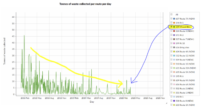
  7. Creating an example infographic (showing the downward trend in missing bins) from the linked data graph:  

 Conclusions 

  • It took a not insignificant amount of consideration to convert the 3-star non-linked data to (almost) 5-star linked data. But I expect that the effort involved will tail off if we similarly converted further datasets, because of the experience and knowledge gained along the way. 
  • Having a linked data version of the waste-management dataset promises to make its information more explicit and more compostable. But for the benefits to be fully realised, more cross-linking needs to be carried out. In particular, we need to map waste types to a common (say, SEPA controlled) vocabulary; and map collection routes to a common geographic vocabulary. 
  • We might imagine that if such a linked dataset were to be published & maintained – with other local authorities contributing data into it – then SEPA would be able to directly and constantly harvest its information so, making period report preparation unnecessary.  
  • JimT and I have discussed how the Open Data Phase2 project might push for the publication of linked open data about waste, using common vocabularies, and how our Data Commons Project could aim to fuel its user interface using that linked open data. In order words, the linked open data layer is where the two project meet.